
Partner Home
Wayfair Partner Home is a SAAS platform that facilitates the acceleration and growth of supplier revenue. Amongst its many functionalities, Partner Home allows partner suppliers to create products, view product performance, and optimize products and product reviews.
Overview
Positive product reviews help increase consumer confidence when making a purchase on Wayfair. Healthy review counts correlate to more conversions for suppliers.
Problem
On the current Partner Home platform, the 2 implemented Wayfair review programs are: Tried & True, and Supplier Funded Reviews. The existing tools are fragmented and clunky, which often leads to less than optimal experiences for suppliers. Instead of grappling with the complexity of the tools, suppliers should be able to focus on completing tasks related to managing and growing their businesses. As Wayfair and its supplier roster continue to expand, the experiences provided for suppliers need to simplify their jobs to be done (JTBD), rather than complicate them further.
My Role
I led the product design - user experience (UX) + user interface (UI) - for this project. To ensure an optimized design solution, I also relied on user research and constructive feedback from team members throughout my process.
Design Toolkit


Existing System
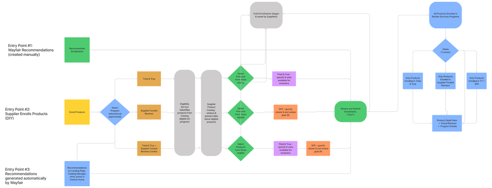
The review programs exist separately in PH today even though the supplier has 1 job-to-be-done (increasing review coverage). This leads to a lack of awareness about both programs and their differences as well as technical issues such as long load times should a supplier switch between applications, hampering the user experience.
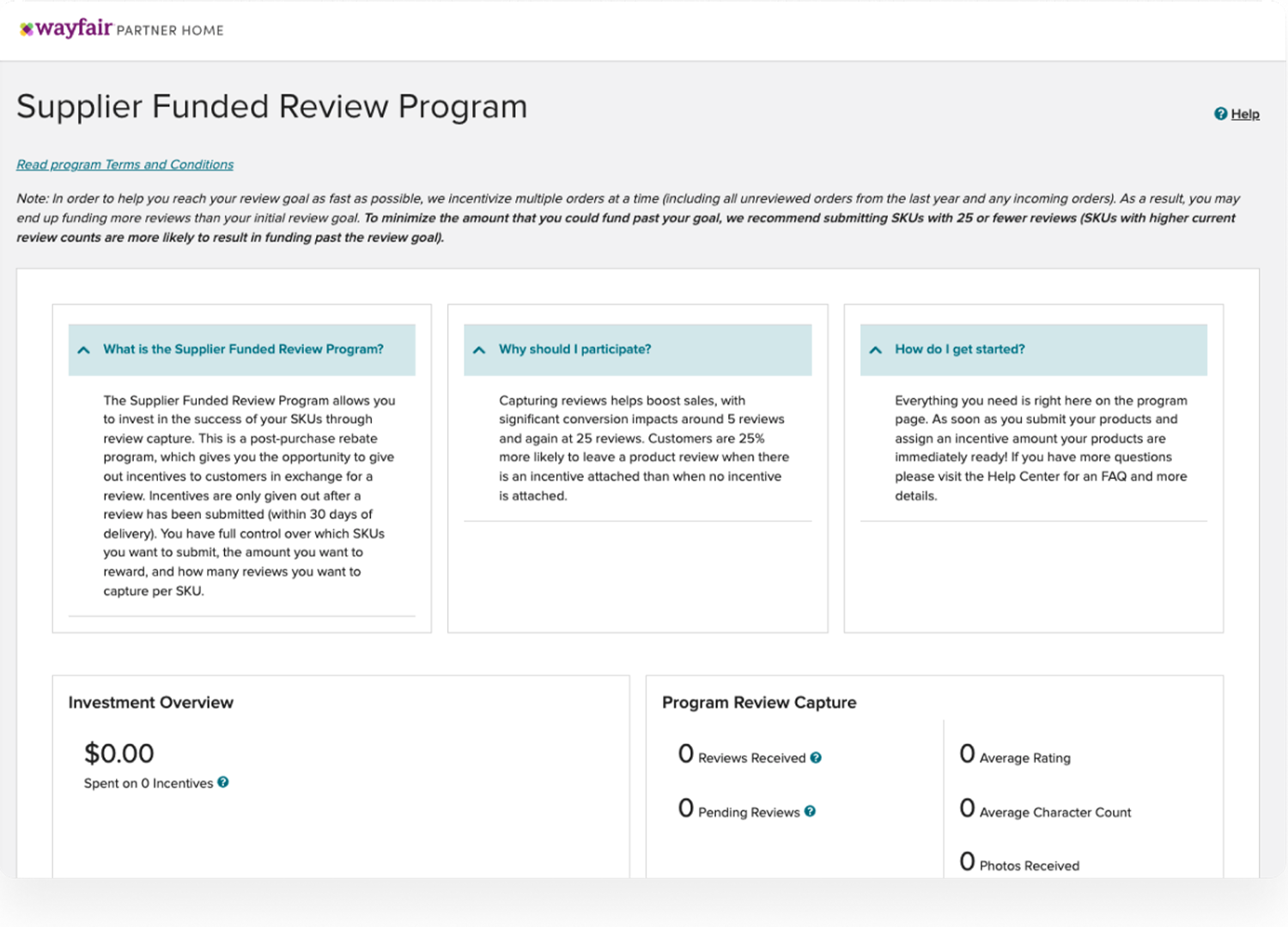
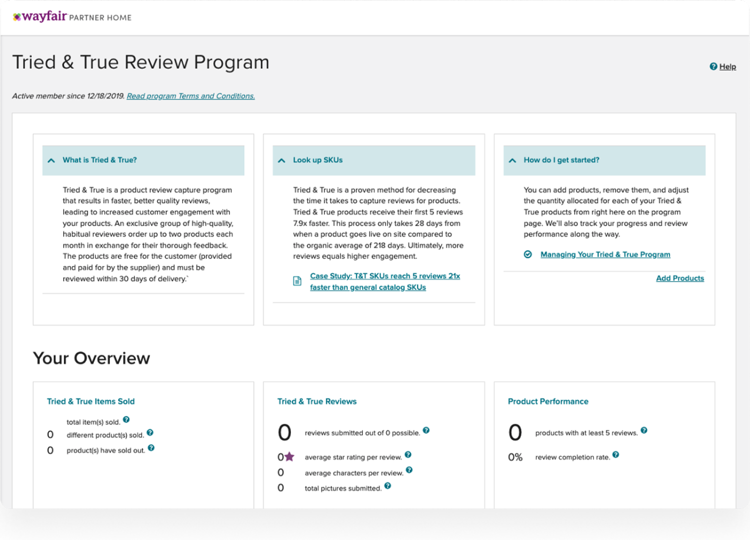
Currently, all the information and data for both review programs is consolidated onto one page. The current structure doesn't take into account what a supplier is trying to do and the time constraints surrounding the task. With all this information presented at once, the outcome is suppliers are left with a high cognitive load, feeling overwhelmed and less capable of making clear business-related decisions. It is also not scalable as it forces suppliers (and their correspondents in Wayfair, e.g. SRMs - Supplier Relationship Managers) to conduct manual and time-consuming tasks across multiple applications and in multiple contexts.

New Experience
Empowering new and existing suppliers by building intuitive self-service tools, which can be leveraged to increase review coverage and grow their businesses.
- - Simple and Intuitive: Build tools and product features that are easy to use for both our new and experienced suppliers, so they understand why, when and how to use each tool/functionality we provide to them.
- - Transition to PH 2.0: Additionally, the existing experience is built using older libraries, and we need to transition to the latest design standards set by PH 2.0. PH 2.0 is about creating a consistent and integrated experience across PH which will benefit suppliers.
- - Reliable & Scalable: Create reliable infrastructure that can scale with the growth of Wayfair as a business.
Design Process
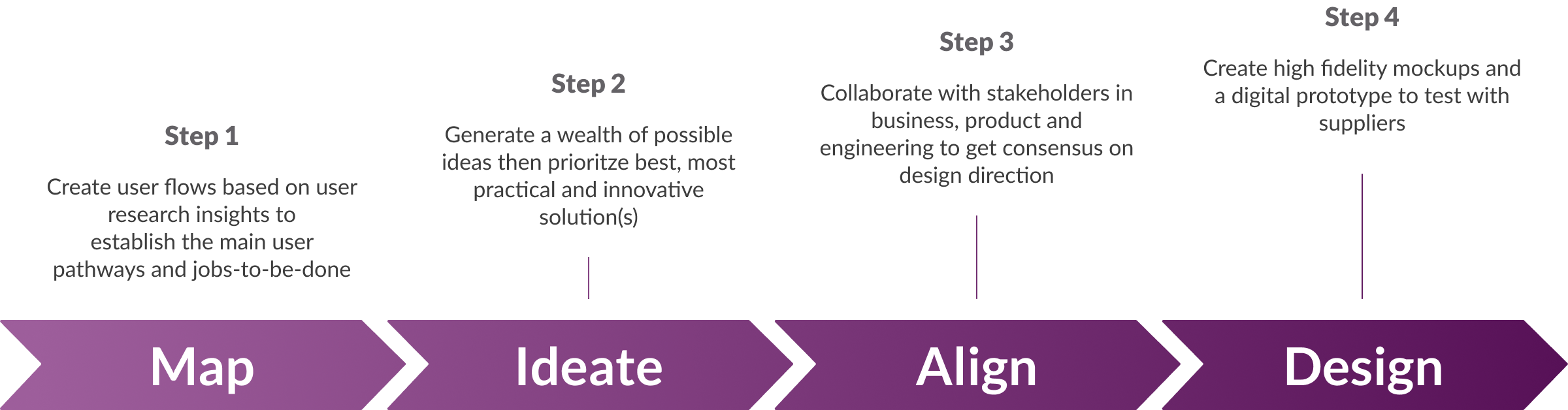
Map
- - How do we structure a unified application that streamlines product enrollment and supports the tasks needed to enroll products?
- - How do we establish consistency across Programs and Services’ family of apps such as VMS and help drive patterns for transactional flows across PH?
Ideate
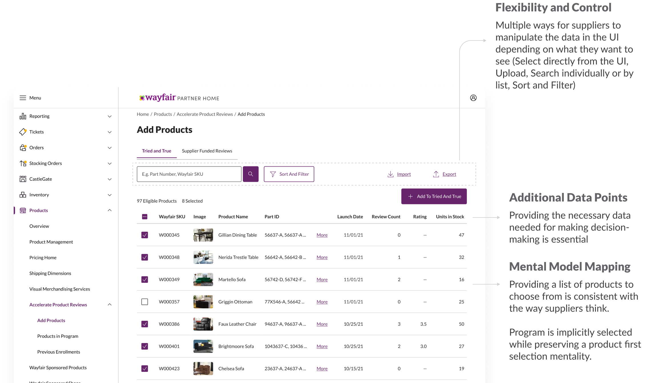
Generating a wealth of ideas helped us prioritize the best and most innovative potential solutions. The biggest challenge was creating a flow that supported the difference in nature of both programs. Ultimately we landed on a solution in which the service is implicitly selected, but is still aligned with the supplier 'product first' mentality.

Align
Collaboration throughout the process enabled all members of the team (business + product + design) to be on the same page from the start.
Our strategy revolved around giving suppliers the freedom and flexibility to use the application the way they want, while still providing guidance and guard rails to help them make suitable decisions. The future vision of the product also helped guide the design decisions for an MVP.
Through team work we were able to land on a solution where each aspect feels like a piece of the puzzle. Suppliers can now complete multiple related tasks without switching applications. This was achieved by transitioning from two explicitly different journeys (DIY flow + Recommendations) to a unified experience.
One JTBD, One Tool
Suppliers want to increase review coverage (to ultimately drive sales). Why force them to go through two explicitly different, unconnected journeys when they have the same goal?
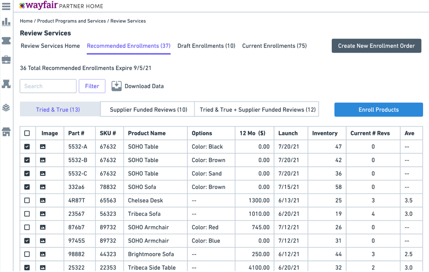
Landing Page
The landing page supports 3 functions

Adding Products
The redesign aims to increase visibility into supplier catalog, give suppliers the data they need within the UI, save time and eliminate mundane repetitive and time-consuming tasks so suppliers can focus on operating their business efficiently.
Usability Testing
To evaluate the new designs we conducted usability tests with 7 US based suppliers of varying sizes. SKU enrolment in one or both review programs ranged from 1008 to 23,833.
Tried and True | Supplier Funded Reviews

Evaluation & Insights
Improving Visibility
Users struggled to complete specific tasks without signalling from the application. This indicated a need for increased visibility or training for new users.
Recommendation
Explore methods of shifting the tooling into the Manage section. Also consider changing the modal to an Agree acknowledgment.
Difficulty with Content
Users described feeling confused by the modals and were unable to accurately interpret the information.
Recommendation
Continue collaboration with Content Strategy team to consider best practices around information wording, in order to improve comprehension.
Improve Education
Users noted that they found it difficult to understand the components of the two programs. They also expected a level of explanation/guidance on the benefits of each program.
Recommendation
Include highly accessible and common language education about different programs and their potential benefits, such as tooltips.
Functionality Needs
Users felt satisfied with some new features; however they sought additional functionality to improve their experience.
Recommendation
Continue to offer these new features to users, and consider adding the requested functionalities.