Peep App - Product Design
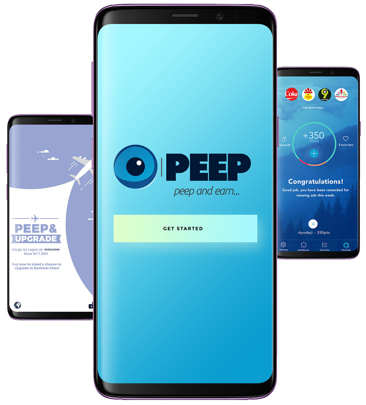
PEEP is a platform that maximizes ad reach for brand advertisers through incentivized viewing for customers. It's a programmatic advertising solution that enables advertisers & brands connect directly with their target audience. Leveraging on unique technology, users get rewarded for viewing and engaging with content.
The Problem
1. Ad Traffic but no conversions: By 2020, 63% of all digital will be programmatic.
2. Banner Blindness: According to a study, 86% of consumers suffer from banner blindness.
My Role
I led the Product Design - User Experience (UX) and User Interface (UI) - of this project as well as utilizing constructive feedback from team members and user research for optimization of design.
Design Toolkit

Design Process
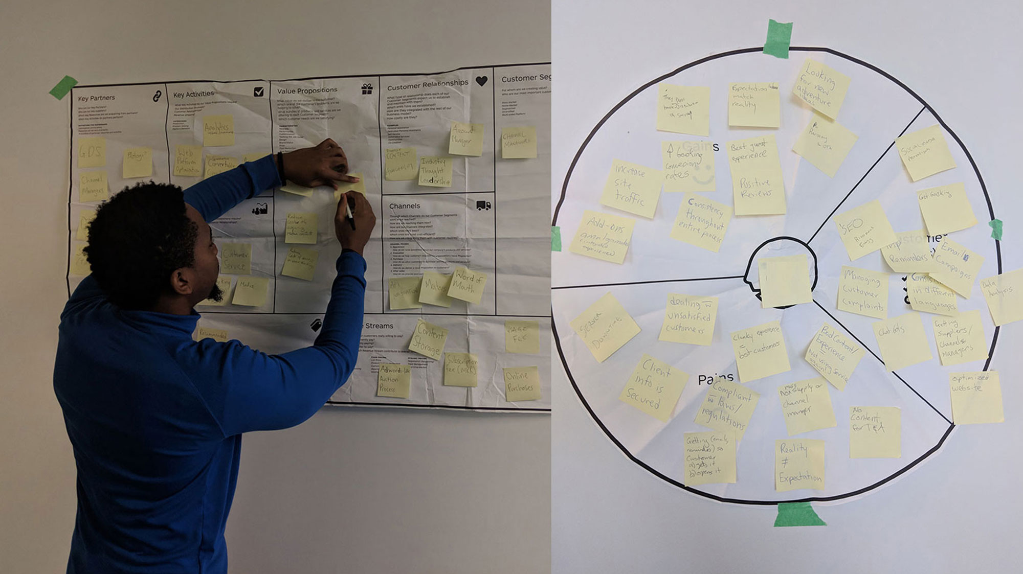
The first step of the design process involved user interviews and secondary research to understand how competitors and users behave. I believe it’s important to get this information in the initial stages of the process, before having an idea or prototyping.
After analysing this insights, I began to conceptualize the solution, focusing on user flows and wireframe to give me a way to iterate faster through ideas. From this, I went to the production mode, designing the interface considering design principles such as contrast, hierarchy and feedback; brand attributes; user interactions, and information architecture.
Define The Audience
There were two potential user groups that could make this product successful:
Group 1
- - Millenials
- - Gen Z
- - Gen X
Group 2
- - Brands
- - Digital Agencies
- - Business Owners
Group 1: The target market in this group have access to smartphones and are keen mobile data consumers who spend money on data to interact, educate and entertain themselves.
Group 2: Group 2: This consists of the campaign providers who will push ad content so that the consumers in group 1 will interact with it in order to serve their business objectives.
Discovery
My team and I conducted secondary research on competition and then proceeded to conduct user research. We did this by setting up focus groups of university students who were our potential target market.
Research Goals
- - Uncover mobile phone habits
- - Current process of engagement with ads
- - Receptiveness to viewing ads
- - Conversion rate of customer engagement with ads
Research Methods
User Interviews
- - Target location: Popular federal Universities
- - Sample size: 50 students each
- - Digital agencies: High level personnel
Surveys
- - Personal network : Family & friends
- - Professional network: Companies, Job colleagues
- - Social media: Facebook, Twitter, Instagram
Insights
After analysing the interviews, these were some of the most relevant results to help identify the problem and possible opportunity areas:
- - 90% of time spent on phone is on social media
- - Mobile Data and Call Credit are very expensive
- - Users struggle to keep up with engagement with brand ads
Opportunity Areas
- - Reduce frustration from viewing ads
- - Incentivization for viewing ads
- - Increase reach, customer engagement and revenue for ad engagement
Problem Statement:
“Ads have become overwhelming to consumers,and underwhelming for brands.”
Understanding User Context & Needs
Building on research insights, I used user stories to evaluate user needs as a way of mapping possible areas in which their experience could be enhanced.
As a user, I don’t want to be interrupted by ads as I use my phone.
As a user, I want to exert minimal effort to engage with an ad so that I don’t get frustrated.
As a user, I want to be incentivized for engaging with ads so that I can earn some rewards.
Generating Ideas
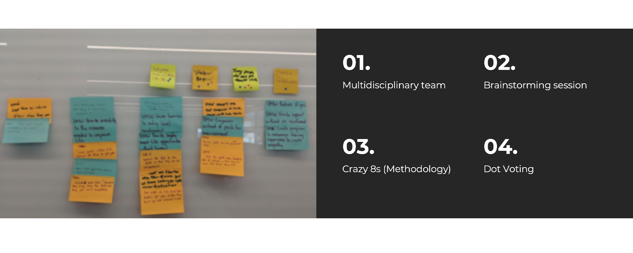
Using different methodologies, a team of 4 including a software engineer, a PR & marketing specialist, a business analyst and me as the product designer collaborated to explore different ideas to think about how to bring the product to life.
Some Ideas
Social Media Retarget Ad
This mobile app would allow users to share ads visible to them in the application on their social media pages so that they can get incentives from the brand advertiser.
Gamification App
This app would allow users to play brand sponsored trivia games and incentivize them for engaging with the brand.
View Ad on Lockscreen
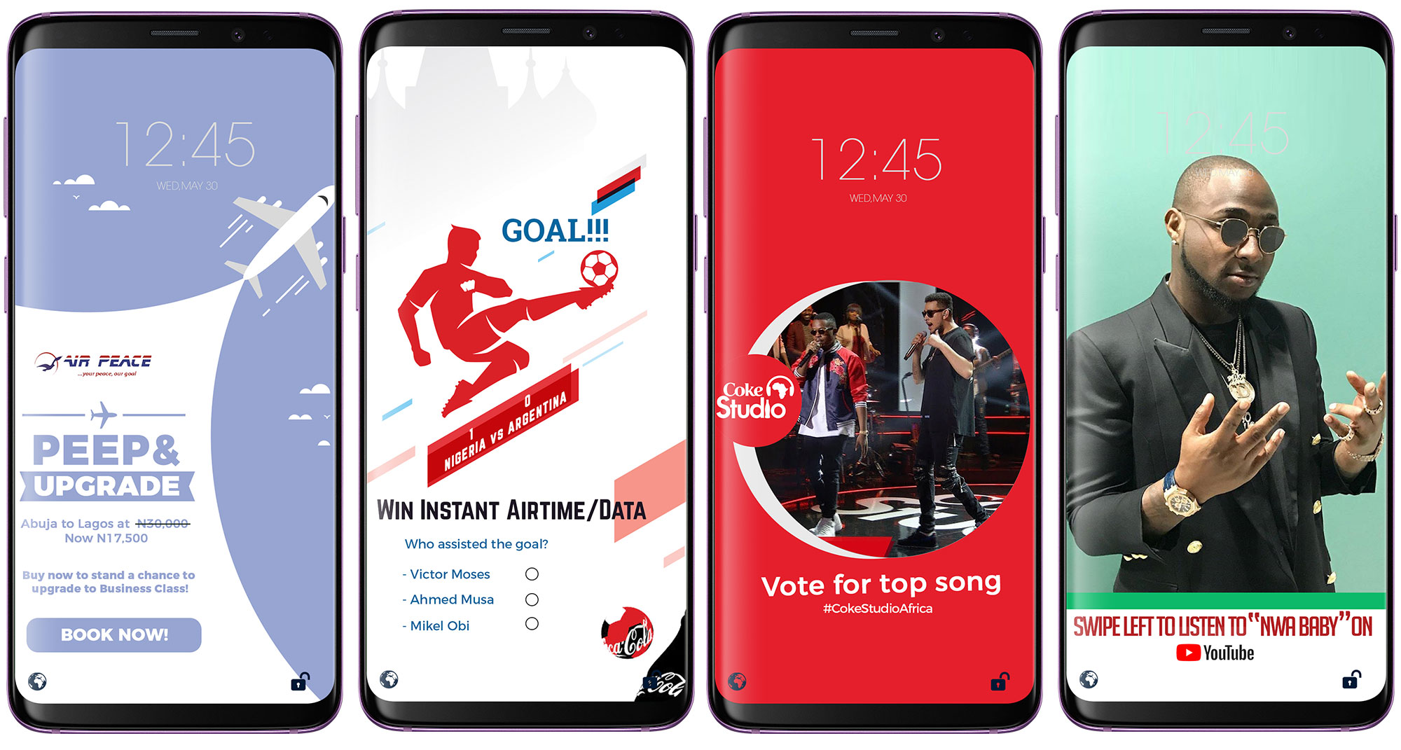
This mobile app would allow users to view an ad on the lockscreen of their phone before they unlock the phone and calculate points for viewing each ad in order to make the users eligible for rewards.
Using the dot voting system, the team was able to streamline which of the ideas generated fit the scope, aligned with research insights and feasibility in terms of development.
Solution
PEEP for Advertising
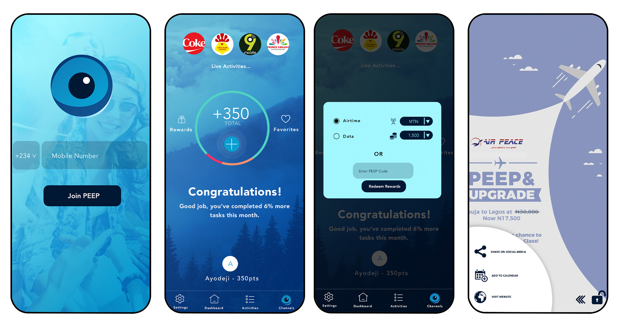
Through PEEP’s unique second screen (lockscreen) functionality, brands can now rise above all the clutter as users view and interact with your brand’s message first. Guaranteed rewards also incentivize the attention of the target audience.
PEEP for Customer Engagement
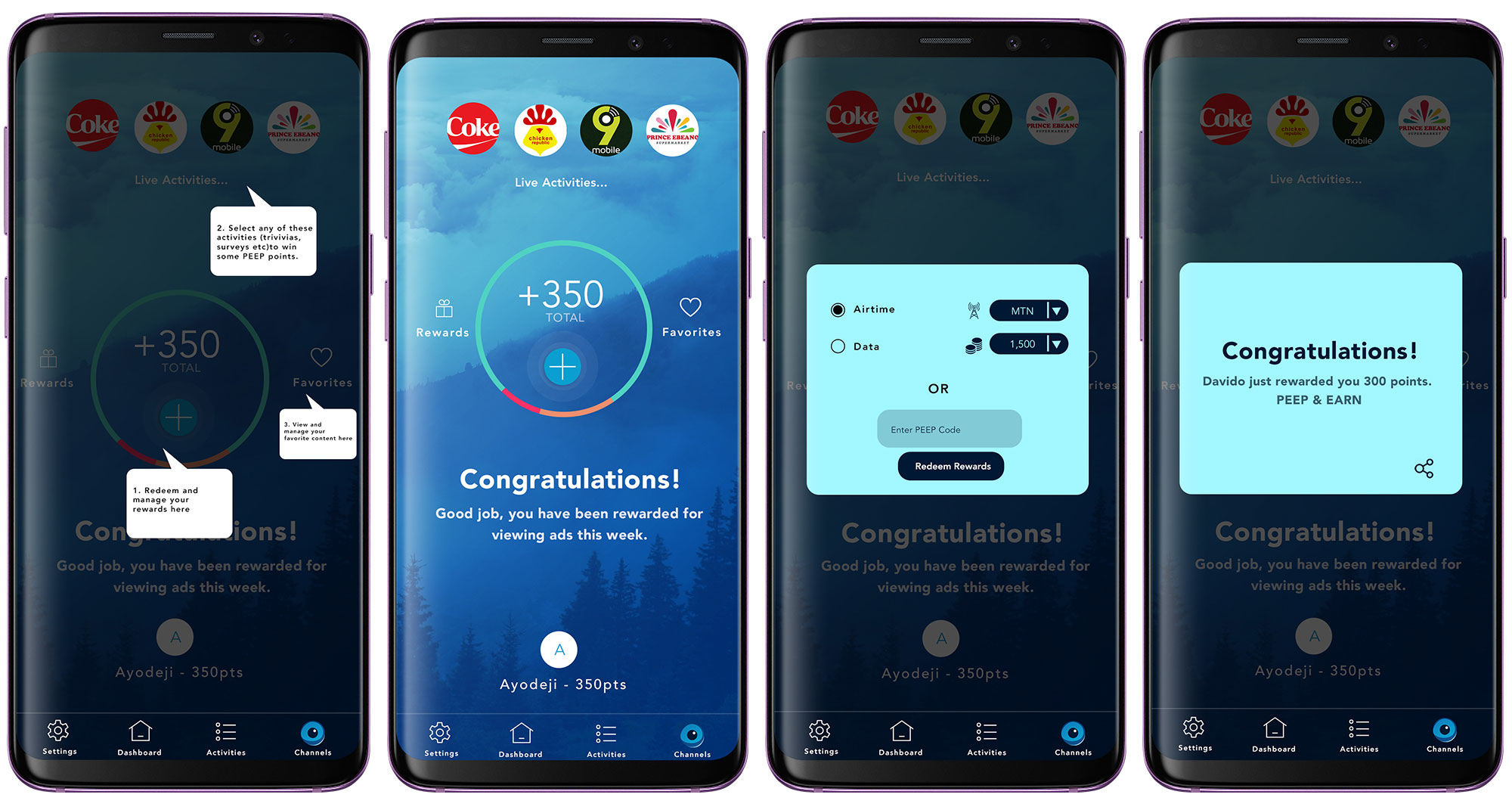
Brands can harness PEEP’s robust engagement features to interact with and learn from customers.
PEEP for Customer Rewards
Rewarding Customers for certain behavior and loyalty over a long term is important for customer retention. PEEP makes this easy by offering consumers a variety of rewards (cash or commodity value).
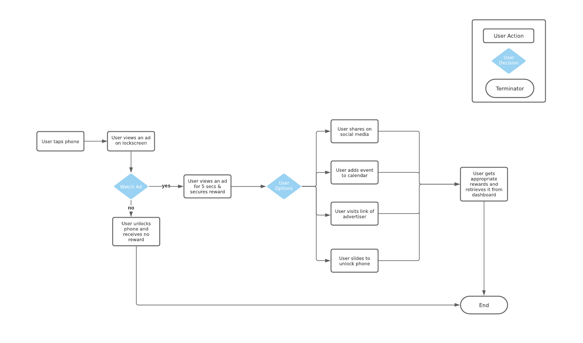
User Flow
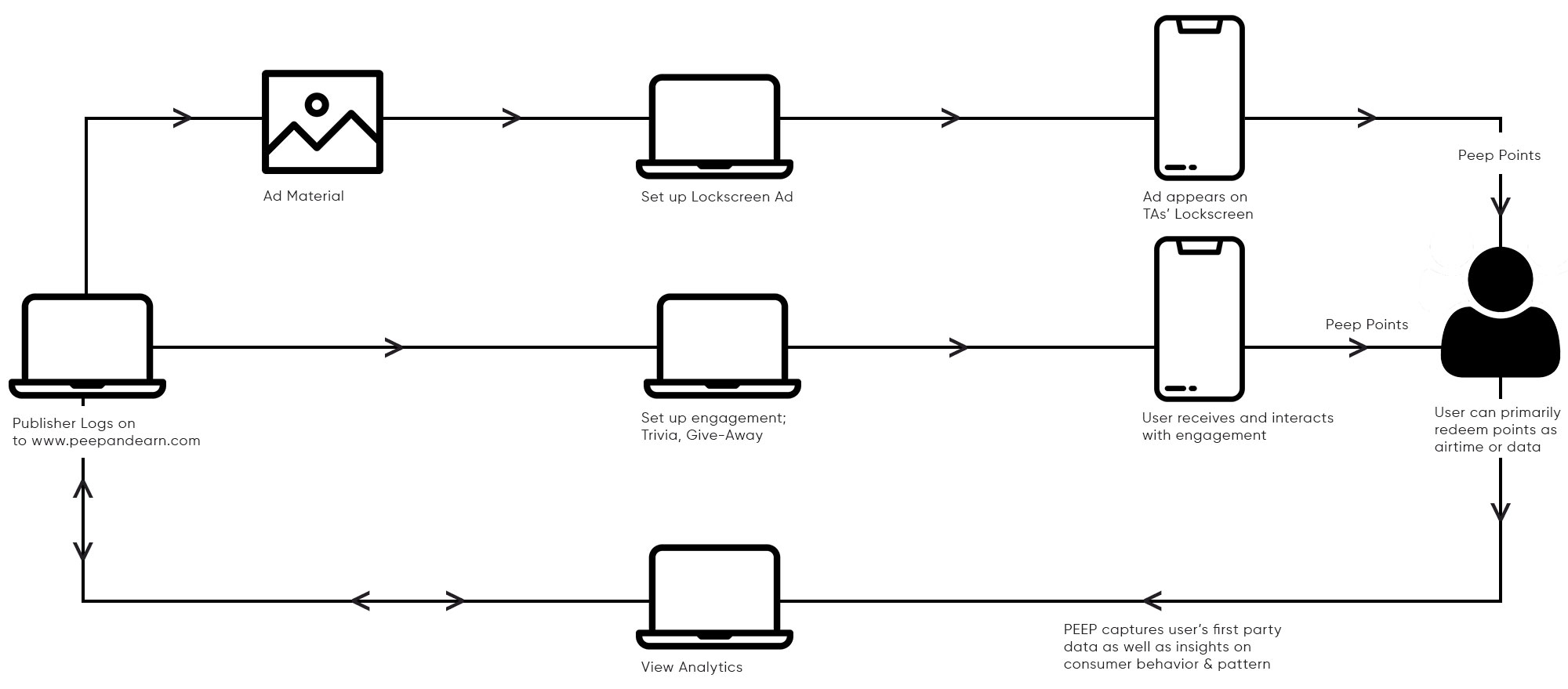
Use Case: User receives ad on mobile phone lockscreen
Assumption: The user is an existing product user, has registered, and has location services turned on.
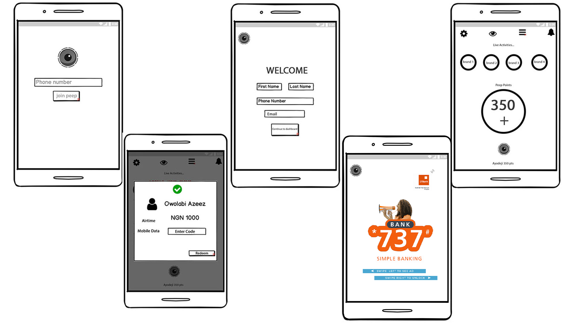
Wireframe
I focused on designing out the ux patterns and templates for each mobile screen using the wireframing tool Balsamiq. I collaborated with the team to draw out the flow of the app from the perspective of the user.
User Testing
As a team we gathered a list of personal connections and decided to perform user testing with them for the wireframes.
Positives
- - Registration was very fast and easy
Negatives
- - Placement of navigation was not intuitive for the users
- - Swipe effect did not appear seamless with ads
- - Nothing indicating where to click for rewards
Solution
Through PEEP’s unique second screen (lockscreen) functionality, brands can now rise above all the clutter as users view and interact with your brand’s message first. Guaranteed rewards also incentivize the attention of the target audience.
Call to Actions are easy to create, but hard to make customers follow through. Through PEEP’s unique first to view and incentive driven features, brands can increase conversions on their CTAs.
Key Insights
Initially we created the application with the intention to manage ad campaigns which would then communicate through our API to PEEP app users. However, we conducted testing with a select group of users and discovered it is much more efficient for publishers to have control over the ads and this indicatded we needed to create a service based model of our application so that ad creation is autonomous.
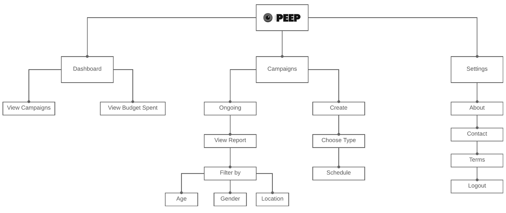
In order to break this down I created process flow diagrams to envision a web app module for our application.
Information Architecture
At this stage it was important to break down the necessary actions the users will take. I utilized Card sorting as a tool in collaboration with business stakeholders to help me understand how our users view, categorize and label content in order to help me structure the navigation for the application.
Web App
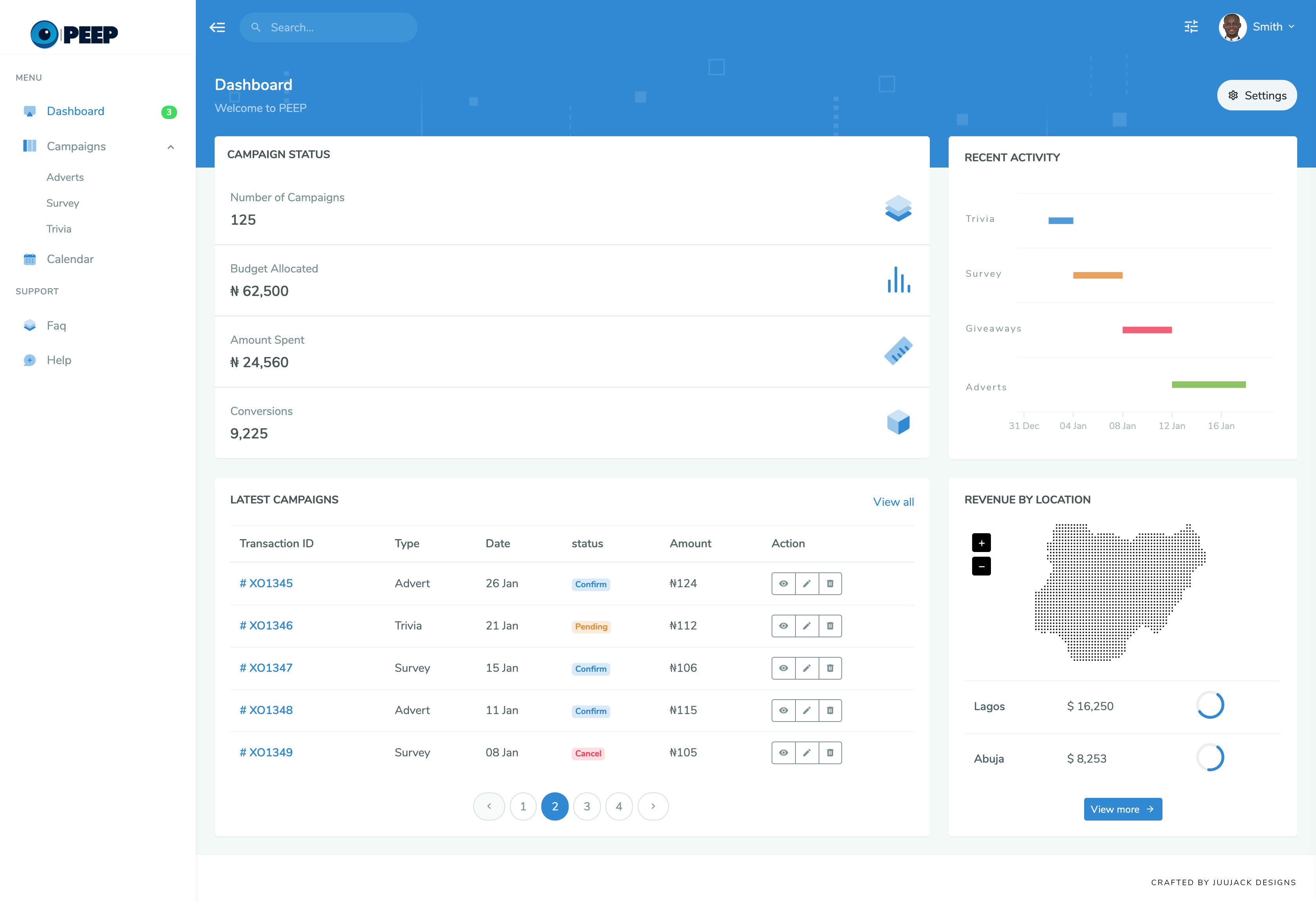
Below is the high fidelity prototype of the dashboard for business stakeholders. They will setup ads on the platform, publish it and these would connect with our API to feed content on our mobile app.
Outcome
This project highlighted the importance of the Software Development Lifecycle Cycle utilizing tools like JIRA for project management and Balsamiq to create wireframes. My team and I successfully deployed the mobile app and our technology got acquired by investors from a top media firm in Nigeria for $552,000 vested over 3 years.
